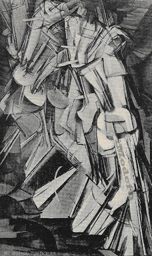
Cubism (1907-1915) Futurism (1909-1914)
Italian Futurism: A movement all designers can learn from
Relating graphic design to modern art may seem like a stretch. On one hand, you have design which is a practical marketing tool used to appeal to viewers. And on the other is modern art which aims to challenge viewers and really get them to think.
However, if you’ve encountered a design brief that asked you to visualize abstract concepts — youthful, dynamic, powerful, trustful — then finding inspiration from modern art is not that far off. And the perfect art movement to look at is Italian Futurism.
Futurism, originated by Filippo Marinetti in 1909, rejected the past and set out to celebrate a number of abstract concepts like speed, machinery, violence, youth and industry. Even more abstract — kinetic energy, duration and simultaneity. How’s that for a design brief?
Yet, artists achieved precisely what they set out to do by working with extreme contrast in colors and shadows and using intersecting lines to show movement.
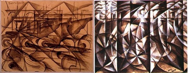
Speeding car (1913) and Speeding car plus light (1913) by Balla
Futurist, Giacomo Balla used diagonal lines to create movement and speed — his multiple circles suggested the specific movement of a car. The chaotic placement of each element does a great job at appealing to our emotions.
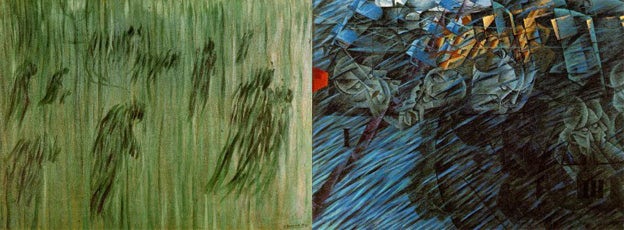
Unlike Balla who explored speeding cars and light, Umberto Boccioni, a leader of the Futurism movement, was interested in capturing the endless movement of life.
In his paintings, Boccioni created an imaginary representation of his subjects by representing them with curvilinear patterns. The crowds are contrasted and surrounded nicely with linear lines.
States of Mind, Those Who Stay (1911) and States of Mind, Those Who Go (1911) by Boccioni
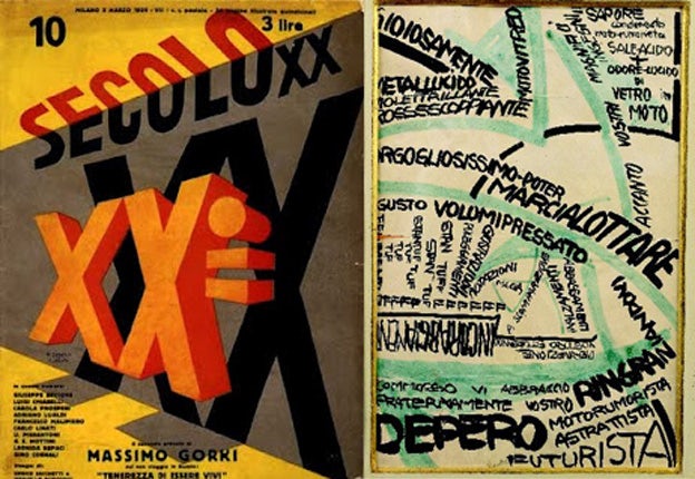
Futurist art included more than paintings. Fortunato Depero’s magazine cover and letter composition primarily uses text designed to show depth as well as movement. The cover plays with perspective by having elements decrease in size from right to left.
Although the letter is more 2D, it still accomplishes movement with green, arrow-like lines that direct the eye from word to word.
An ode to the 20th century, Magazine cover (1929), and Free-word composition letter addressed to Marinetti (1916) by Depero
During the Futurism movement, there were other subjects artists were attracted to, World War I being one of them. It was a great subject for art and artists believed it was the chance to give Italy a new identity.
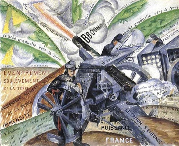
Gino Severini’s Guns in action combines text, lines and illustrations to convey war scenes. Viewers’ eyes are drawn to the centered “Bboumm” — a familiar sound heard in war. The lines and curves create disorderly movement while words are placed to complicate things a bit more.
Guns in action (1915) by Severini
The futurist movement was short-lived and ended in 1916. However, its influence goes much further. Here are poster designs that were influenced by Futurism:
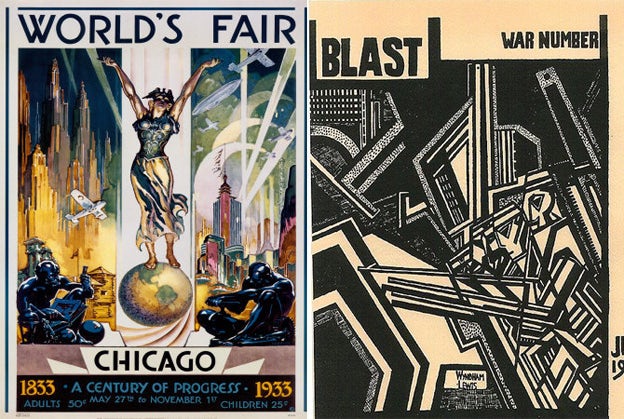
Art Deco in the 1933 World’s Fair, and Vorticism in Wyndham Lewis’ BLAST
In the World’s Fair design, we clearly see the industrial theme being presented with flying airplanes, cities and flashy lights.
In Wydnham Lewis’ BLAST, and the cyperpunk comic books below, we can definitely see influences from futurism. We not only see similarities with cyberpunk’s high tech, low life philosophy but each design incorporates many Futurist techniques.
Can you tell us what they are?
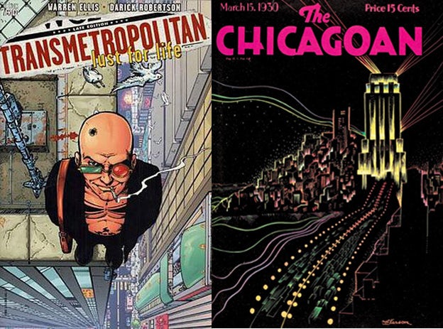
Transmetropolitan Vol 2 cover by Darick Robertson; The Chicagoan Magazine cover

